

Welcome back to Critical Density. Previously, I explained why forecasts have underestimated the impacts of introducing tolls and overestimated the impacts of raising tolls. Then we heard about the history of ridehail taxes. Now I am back from the Transportation Research Board Annual Meeting with more of the congestion pricing content people crave. It has been a big week with the launch of congestion pricing in NYC. Since the only data published seems to be from congestion-pricing-tracker.com, most commentary online has revolved around this. Today I will make two points about interpreting this data.
1. Internal travel times
According to the congestion-pricing-tracker, the reported travel times across bridges and tunnels have fallen drastically but those inside the zone haven’t budged. Many people have noted this online and even inferred lessons from it.
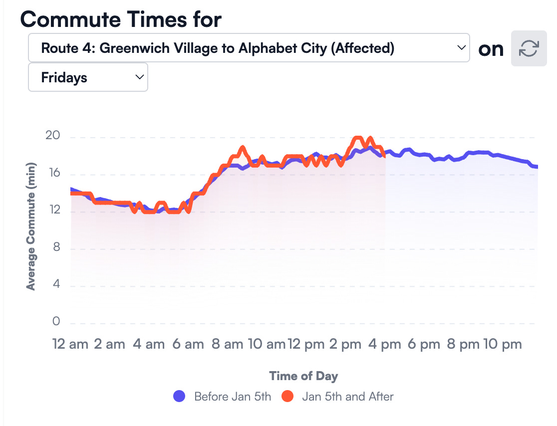
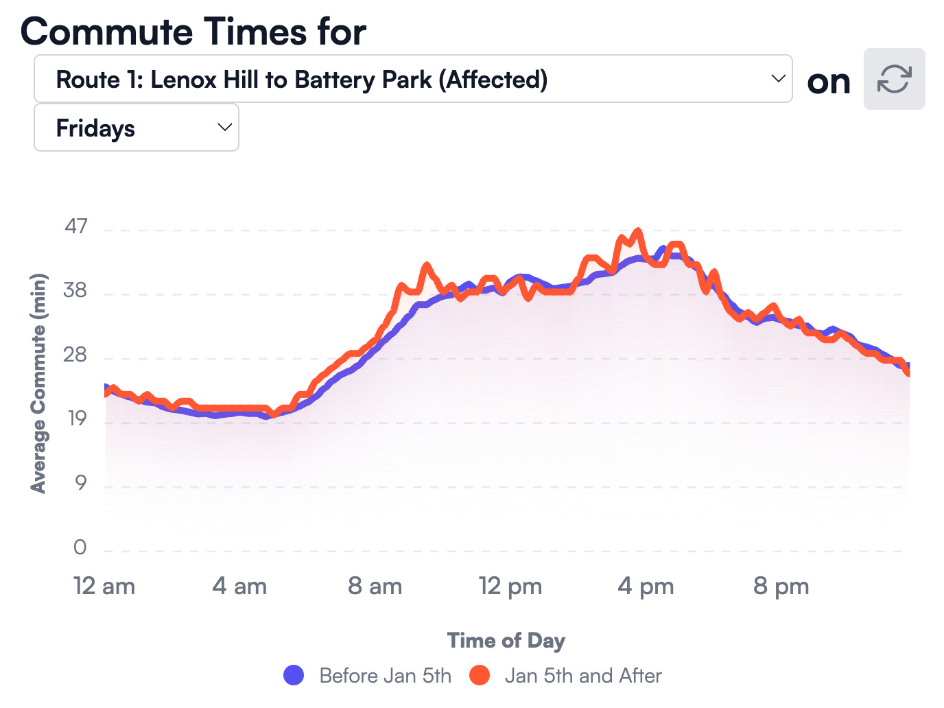
I am skeptical of this null result. Friends tell me that traffic is much lighter within the zone and that buses are faster. Streetsblog interviewed a bus driver who says the bus is faster and that other bus drivers say the same. There are posts on social media with striking pictures and videos. Here is a NY Times article with first-hand accounts.
If traffic is actually moving faster, then why don’t we see shorter travel times? I can think of two reasons:
Interpolation. The travel times are from Google Maps queries. Google Maps travel times are predictions from models which use both real-time and historic data. Every 15 minutes, there are few trips beginning/ending between the exact origin/destination pairs selected within the zone. Every 15 minutes, many trips go from one side of a tunnel/bridge to another. So the numbers track historic averages more closely on routes with fewer real-time measurements. Huh.
Fleet recomposition. Google Maps collects speeds from people driving around with Google Maps and Waze on their phones. If tolls have repelled more passenger than freight trips (I think they have), then this sample has tilted more toward trucks and vans.
So in summary: we have (a) “lived experience” that traffic is lighter, but (b) travel time predictions that show no change, and (c) two explanations for why we could see (b) even if (a) is true. I suppose time will tell.
2. Travel times don’t indicate flows
While we see large changes in travel times on some routes, these don’t necessarily mean commensurate changes in flows: the number of vehicles crossing per interval of time (i.e., per 15 min, hour, day). So we can’t reach conclusions like: “A lot fewer people are coming from New Jersey” using the travel times data—even though travel times from New Jersey are much lower.
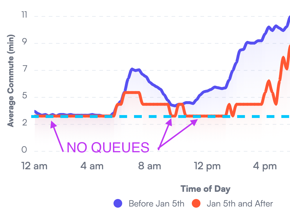
For some routes (bridges and tunnels), we can make some light inferences about flows at certain times of day. The travel times will tell us if there is a queue: a line of cars sitting close together and moving slowly. Queues of all lengths will usually have the same exit flow: the rate cars leave the bridge/tunnel. This flow is the capacity of the bottleneck associated with the route. For bridges and tunnel routes, the bottleneck is usually either a merge before the bridge/tunnel or an exit ramp or signalized intersection after the bridge/tunnel.
Here are travel times for the Lincoln Tunnel route. The teal dashed line is the free-flow travel time. Whenever the red/blue lines are flat at the teal line, there is no queue; vehicles are leaving the queue at a rate below the capacity of the bottleneck. Whenever the red/blue lines are above the teal line, there is a queue; vehicles are leaving at about capacity. So by comparing the red and blue lines, we can infer: the exit flow is now lower around noon; but in the morning the exit flow is about the same as before—even though the travel time is much lower (because the queue is shorter).
Thanks for reading.
This is a fun time to study traffic. Over the next few months we will receive (at least):
Volume (flow) data from bridges and tunnels
Bus travel times
TLC data from ridehail/taxi trips
Could traffic signal timings be causing “sticky” internal travel times? I’m not sure how NYC operates its signals, but in most places they’re calibrated every few years. Signal timings optimized for higher volumes would yield longer cycles and green phases that are longer than necessary to clear the queue at the signal. This is inefficient and could partly explain why travel within the zone hasn’t realized larger travels time savings.
great article! I work in a building with a view of midtown and I anecdotally have also seen much less traffic on 32nd/33rd st and 9th/10th aves.
A few additional points:
1) it looks like subway ridership is up 8% YoY and commuter rail ridership is up 13%. It makes sense to me because the portion of subway rides going into the congestion relief zone is probably smaller than for MNr/LIRR
2) to add to your section on queuing, the way I think about it is that impact of each marginal car on congestion is not linear. if a tunnel has capacity for 2,000 cars per hour, going from 1,500 cars to 1,600 probably won’t impact the flow of traffic at all. but going from 1,950 to 2,050 could create a significant slowdown